Project Mantou
Making health education easier to discover across China’s mobile, web, and WeChat ecosystem.
Overview
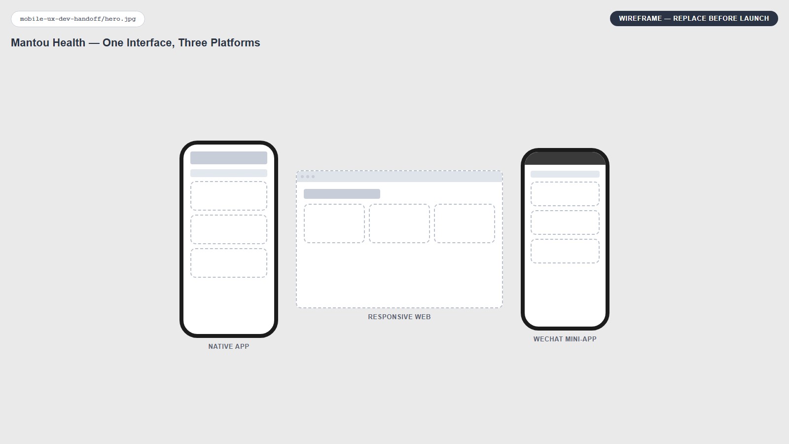
Project Mantou was a health-education platform for users across China. It combined searchable videos, articles, and infographics with a points system that rewarded learning and could be redeemed for discounts with partnered healthcare providers.
My ownership: the full design process from discovery and research through product definition, UX/UI, prototyping, usability testing, design systems, engineering handoff, implementation, and QA.
The Challenge
- Limited access to many international health-information platforms
- Language and terminology barriers across a broad, non-English-first audience
- Device fragmentation across a wide range of Chinese manufacturers
- Platform restrictions across mobile, web, and WeChat that made reliable content harder to discover and understand
Discovery & Research
- In-person interviews and usability testing after major sprint builds; about 50 participants total, usually 10–15 per round
- Competitive research into Baidu Encyclopedia, WebMD, and local content-discovery patterns
- Device-language and usage analytics to understand language preferences and content behavior
- Research into China’s browser, cloud, device, and mini-app ecosystem; the team ultimately standardized on Alibaba services
- Interviews with prospective content partners to understand credibility, source quality, and international content needs
Designing for China’s Device & Platform Ecosystem
The core design challenge was not a single screen. It was making one product feel coherent across mobile, web, WeChat, embedded browsers, and a broad range of Chinese devices.
1. Responsive Cross-Platform UI
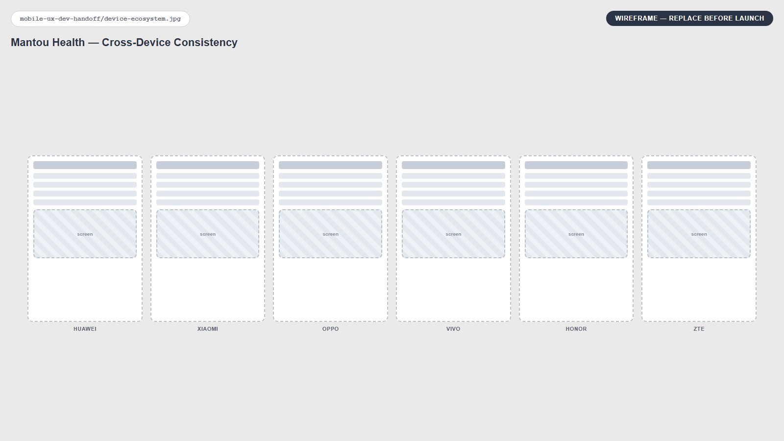
I designed responsive layouts and reusable components that preserved hierarchy and usability across iOS, Android, mobile web, WeChat Mini-App, WeChat browser, and devices from Huawei, Xiaomi, Oppo, Vivo, Honor, ZTE, and smaller manufacturers.
2. Navigation & Interaction Consistency
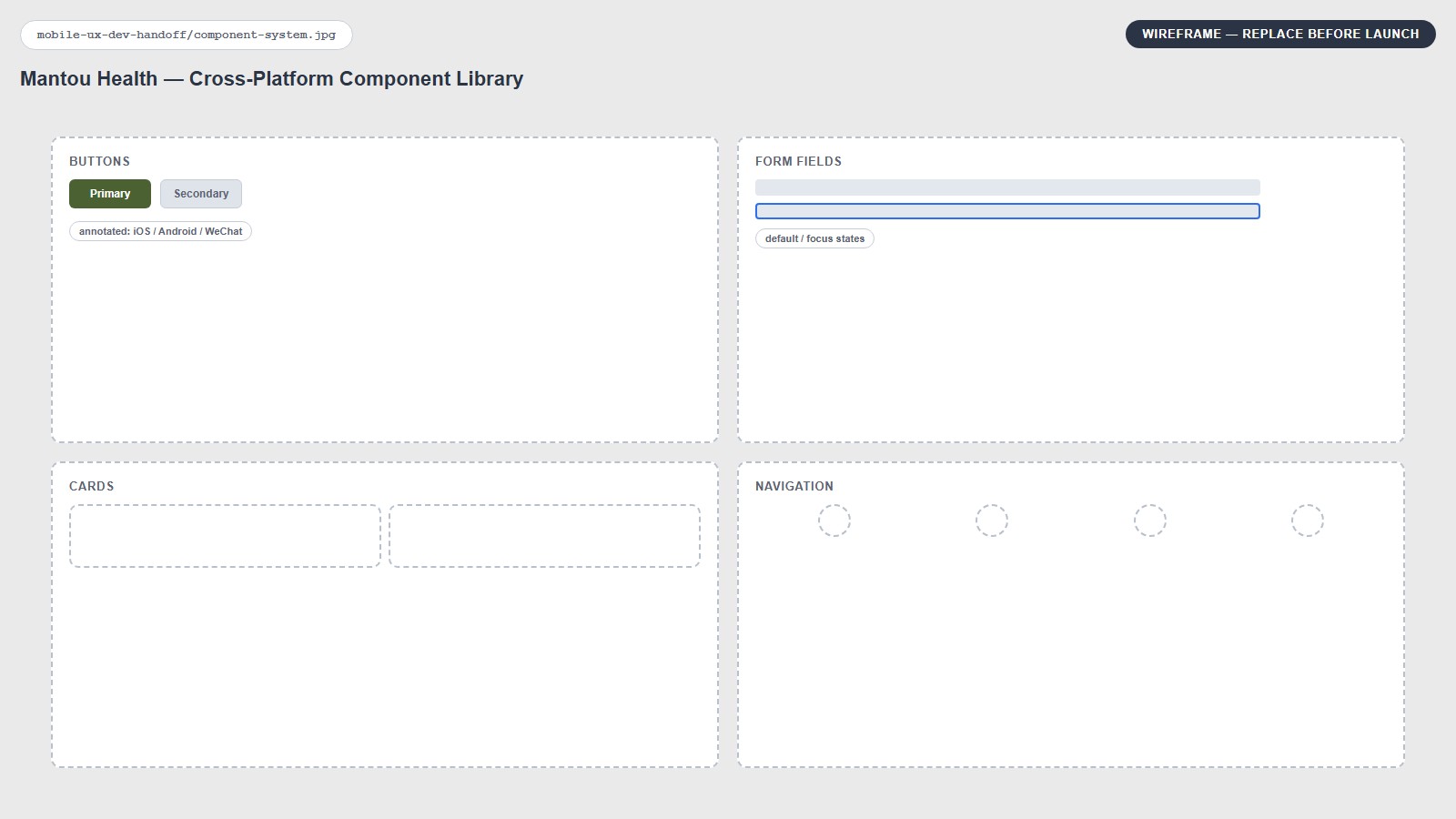
I simplified the core experience into four primary destinations — Home, Discover, Redeem, and Profile — then documented states and behavior so navigation remained familiar despite differences between browser and mini-app conventions.
3. Media Compatibility & Performance
Because Mantou was content-heavy, I worked closely with engineering on video-player behavior, asset compatibility, subtitles, responsive media, and visual consistency across embedded environments. By the later stages, all core flows were validated across every targeted platform and physical device available to the team.
From Prototype to Production
My Figma files were implementation-ready: reusable components, variables, documented states, annotations, asset sheets, responsive behavior, comments, and status updates. I stayed involved through build review and QA rather than treating handoff as the finish line.
A Key Design Decision: Make Search the Product
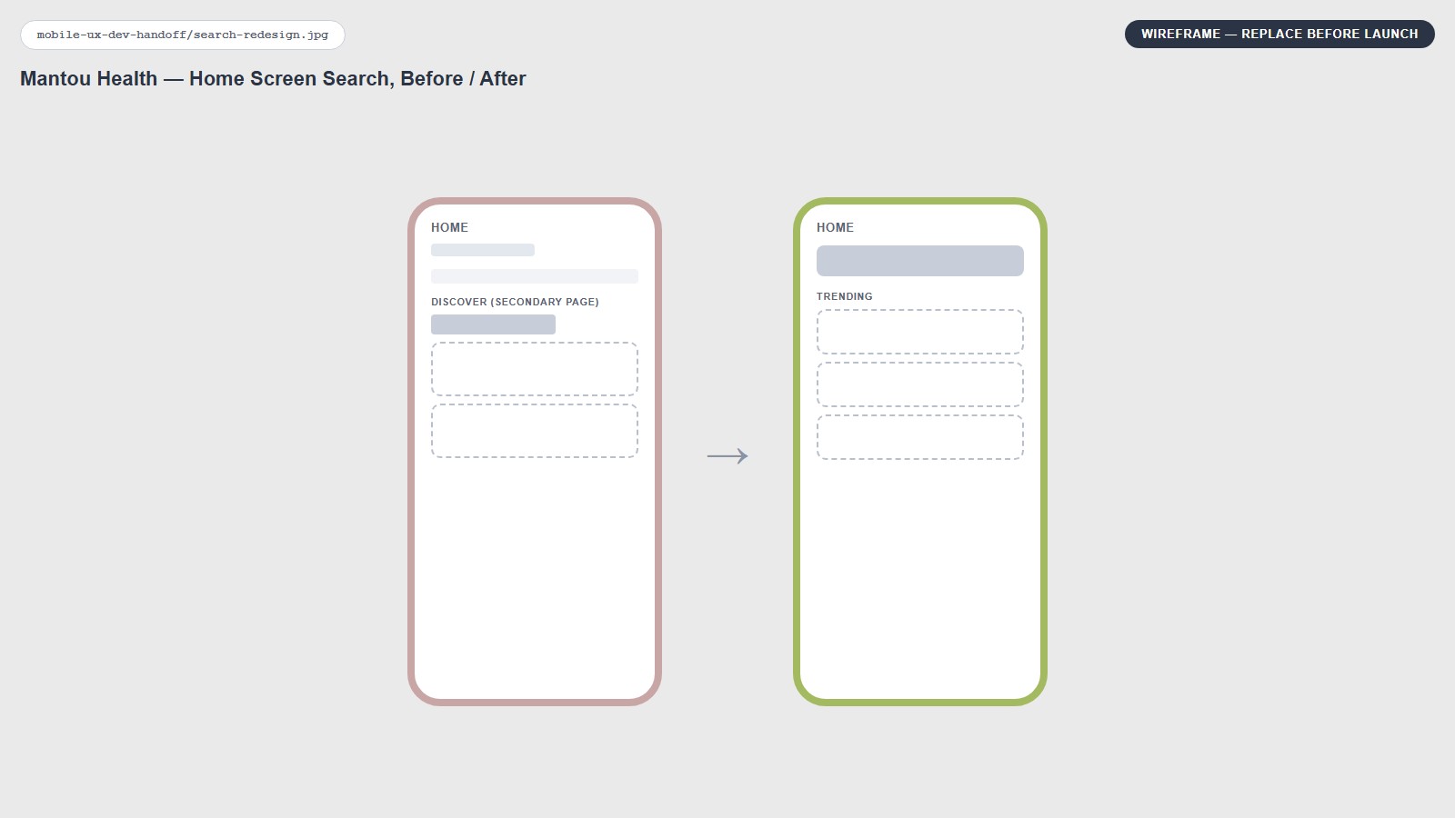
Search originally lived at the top of the Discover page — a conventional placement for a content platform. The pattern was familiar, but testing showed it was not emphasizing Mantou’s most important behavior: asking health questions.
Most participants initially clicked trending or recommended content. That behavior was not wrong, but it meant the core value of question-based discovery was easy to miss. I moved a large search field to the center of Home and kept trending recommendations directly below it.
Trust & Content Quality
Health content carried a higher credibility bar than a typical open publishing platform. Mantou worked with approved partners rather than unrestricted creators. Prospective partners were interviewed about expertise and sourcing, and a medical consultant on the team provided additional domain guidance.
Measure, Learn, and Expand
After launch, content viewership remained lower than we wanted. Interviews and device-language analytics revealed that the audience was more international than the original experience assumed.
AI-Assisted Localization
- Content translation supporting roughly 250 languages
- Video subtitles and transcription
- Semantic question matching
- Multilingual search grouping
- Consolidation of differently worded searches into meaningful trending topics
Translation alone did not immediately create a major jump in viewership, so we did not treat localization as the complete engagement solution. Instead, it removed a major barrier to expanding the content ecosystem.
Business Signal: International Content Partnerships
Localization and AI capabilities increased interest from international organizations. I began meeting with about 3–5 prospective international partners per week, and roughly two-thirds moved forward into partnerships before legal and logistics transitioned to other team members.
Impact
- Search use improved from ~20% to ~80% during iterative usability testing
- ~50 users participated across multiple in-person testing rounds
- AI-assisted content translation supported roughly 250 languages
- Core flows were validated across the targeted mobile, browser, WeChat, and Chinese-device ecosystem
- Localization helped generate signed international content partnerships and broadened the future content strategy
- Delivered a reusable, implementation-ready Figma system with components, variables, states, annotations, and assets
Shipping the interface is not the end of product design. The product has to be measured, challenged, and adapted as new user behavior, technical constraints, and business opportunities emerge.