Dil Mil
Redesigning dating app Dil Mil’s VIP Elite subscription paywall — turning a generic, one-size-fits-all upgrade prompt into a contextual, evidence-backed decision point.
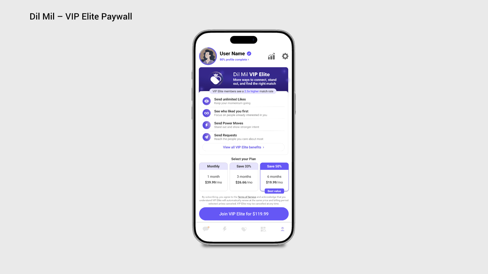
Overview
This app's free users hit a hard daily limit on their core engagement action, then landed on a generic, feature-comparison paywall that didn't explain what the premium tier actually did for them or why it was worth paying for. The brief: redesign the upgrade experience so it's contextual, make the value legible, and increase paid conversion without pressuring the users who choose to wait.
Beyond the screen redesign, I treated this as a systems problem — defining the success metrics, experiment design, and retention guardrails needed to validate it, the same scope of thinking I'd bring to a live product decision.
The Challenge
- A generic, one-size-fits-all paywall interrupted users instead of responding to what they were actually trying to do
- Premium's value wasn't clear beyond “more of the same” — users couldn't tell what made it worth the cost
- Pricing was presented before users understood what they'd be paying for
- No clearly visible free path, leaving users unsure if declining hurt their standing in the app
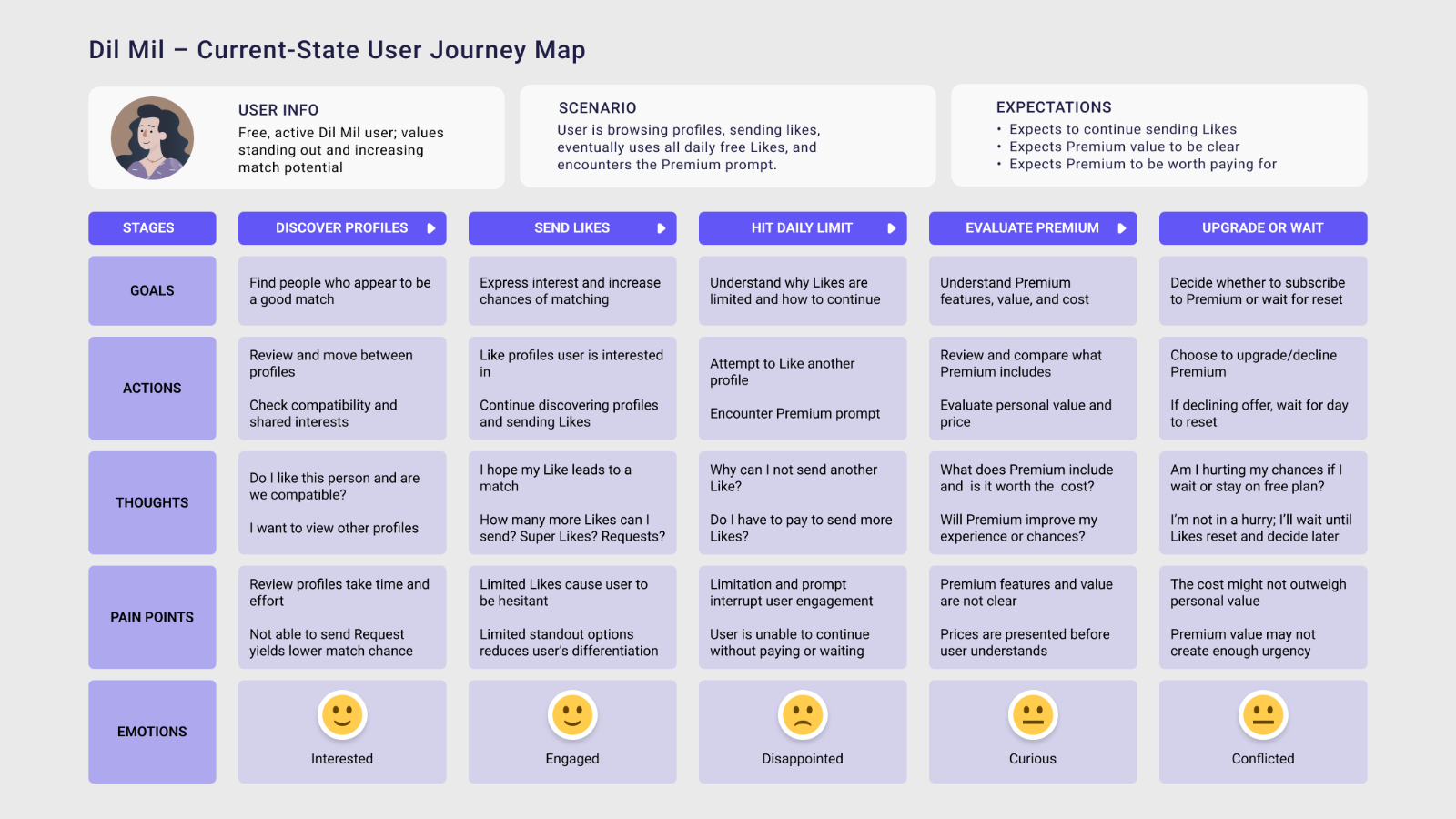
Current User Journey & Key Pain Points
User: a free, active user who values standing out and increasing their match potential.
Scenario: the user browses profiles, sends Likes, eventually uses all of their daily free Likes, and encounters the premium upgrade prompt.
Expectations going in: to keep sending Likes, for premium's value to be clear, and for premium to feel worth paying for.
Discover Profiles
Goal: find people who appear to be a good match.
Actions: review and move between profiles; check compatibility and shared interests.
Thoughts: “Do I like this person and are we compatible?” — “I want to view other profiles.”
Pain points: reviewing profiles takes time and effort; not being able to send a Request yields a lower match chance.
Emotion: Interested
Send Likes
Goal: express interest and increase chances of matching.
Actions: Like profiles the user is interested in; continue discovering profiles and sending Likes.
Thoughts: “I hope my Like leads to a match.” — “How many more Likes can I send? Super Likes? Requests?”
Pain points: limited Likes cause hesitation; limited standout options reduce differentiation.
Emotion: Engaged
Hit Daily Limit
Goal: understand why Likes are limited and how to continue.
Actions: attempt to Like another profile; encounter the premium prompt.
Thoughts: “Why can I not send another Like?” — “Do I have to pay to send more Likes?”
Pain points: the limit and prompt interrupt engagement; the user can't continue without paying or waiting.
Emotion: Disappointed
Evaluate Premium
Goal: understand premium features, value, and cost.
Actions: review and compare what premium includes; evaluate personal value and price.
Thoughts: “What does premium include and is it worth the cost?” — “Will premium improve my experience or chances?”
Pain points: premium's features and value aren't clear; prices are shown before the user understands what they're paying for.
Emotion: Curious
Upgrade or Wait
Goal: decide whether to subscribe or wait for the daily reset.
Actions: choose to upgrade or decline; if declining, wait for the day to reset.
Thoughts: “Am I hurting my chances if I wait or stay on the free plan?” — “I'm not in a hurry; I'll wait and decide later.”
Pain points: the cost might not outweigh personal value; premium's value may not create enough urgency.
Emotion: Conflicted
Proposed Solution
Strategy: redesign the generic paywall into a more contextual upgrade experience presented at the moment the user reaches their daily Like limit, while still providing a clear free option. Communicate how the premium tier offers value beyond unlimited Likes and position it as a premium way to improve user outcomes.
Contextual Upgrade
Present the premium offer at the moment the user reaches their daily Like limit, tying the upgrade directly to what they're trying to accomplish instead of interrupting them with a generic paywall.
Value Beyond Unlimited Likes
Show that premium offers more than unlimited Likes by highlighting benefits that help users stand out, increase their chances of matching, or improve the quality of their interactions.
Clear Plan & Premium Positioning
Clearly identify the premium tier so users know exactly what they're considering, explain the available subscription and pricing options, and position it as an exclusive experience designed to improve outcomes rather than simply remove limits.
Clear Free Option
Make the available choices obvious, including upgrading or waiting for free Likes to reset. Users should understand payment isn't their only way forward, so the experience feels purposeful rather than demanding.
Evidence of Value
Where validated data is available and relevant, display concrete metrics of how premium improves chances, responses, visibility, or engagement — giving users evidence of value rather than relying only on a feature comparison.
Clear Calls to Action
Use explicit CTA language and clear hierarchy so users understand exactly what happens next, whether they're learning more, selecting a subscription option, purchasing, or continuing for free.
Success Metrics & Testing Plan
Current baseline: 2.5% VIP Elite conversion rate.
Hypothesis: if VIP Elite's benefits and value are communicated more clearly and meaningfully around users' goals, users will better understand VIP Elite, progress further through the subscription experience, and convert above the 2.5% baseline.
Measurement approach: track whether the redesigned upgrade experience improves users' understanding of VIP Elite's value, increases paid conversion, supports users in meaningfully progressing through the upgrade funnel, and maintains retention among users who choose not to subscribe.
Conversion
Did more users subscribe?
Conversion rate & lift; conversion by value comprehension; subscription revenue impact.
Funnel Progression
Did users meaningfully progress through the upgrade?
Prompt CTA click-through rate; value comprehension rate; checkout progression rate; prompt abandonment rate.
Retention
Did users continue using the app after the prompt?
Post-prompt session continuation; Like-limit reset return rate; 1-week retention; churn & uninstall rate.
Planned follow-on A/B tests (testing one variable at a time to isolate impact):
- Hero design — tagline, icon, and visual treatment
- Social proof — proof type and outcome metric shown
- Benefit prioritization — which perks appear first
- Pricing presentation — monthly, daily, total, and savings framing
- CTA messaging — action language and price inclusion
- Choice framing — visibility and wording of non-paid paths
Screen Redesign
Replace Comparison with Benefits
Removed the low-value Free versus VIP checkmark table and used that space for a dedicated benefits section focused on why upgrading matters.
Add Evidence of Effectiveness
Added a concise, validated proof point near the hero — “VIP Elite members see a 2.5x higher match rate” — so value is supported by evidence, not claims alone.
Strengthen VIP Elite Positioning
Gave VIP Elite a distinct premium identity through a dark violet hero, stronger branding, refined iconography, and clear separation from free account content.
Clarify the Plan Structure & Pricing
Presented VIP Elite as one product with 1-month ($39.99/mo), 3-month ($26.66/mo, save 33%), and 6-month ($19.99/mo, save 50%, best value) billing options, showing renewal terms clearly and stating the full total in the CTA — “Join VIP Elite for $119.99.”
Guide Decision, Reduce Distractions
Structured the journey as value proposition, proof, benefits, pricing, terms, and purchase — removing/moving Concierge so unrelated content didn't compete with conversion.
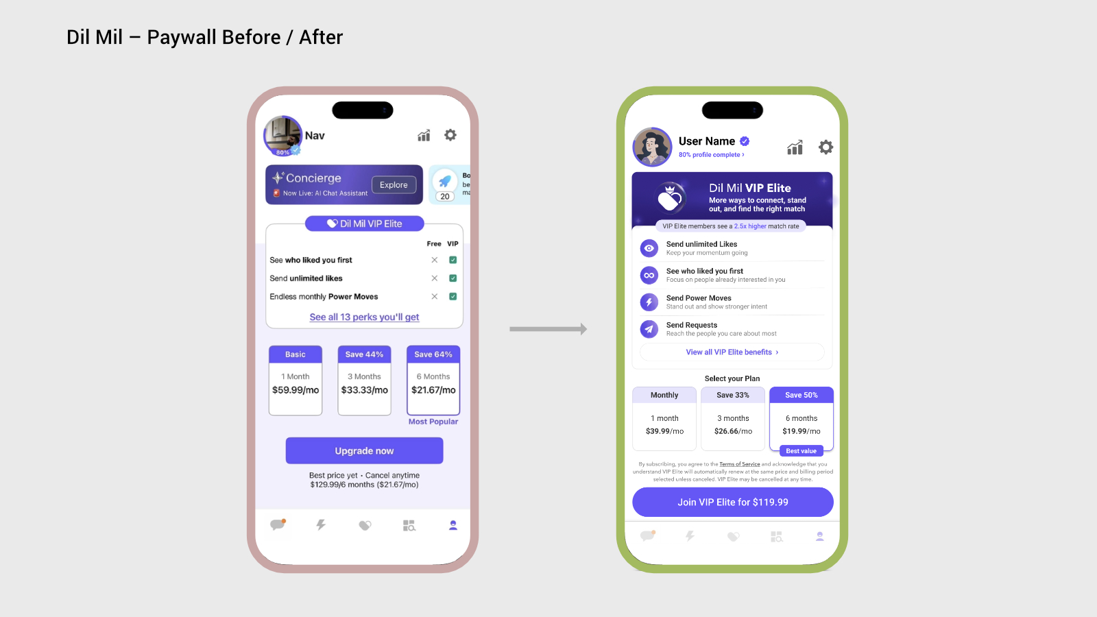
Turn the upgrade prompt from a hard interruption into a clear, informed decision — for the users who subscribe and the ones who choose to wait.