ATRRS
Modernizing a legacy Army training system for usability, accessibility, and maintainability.
Overview
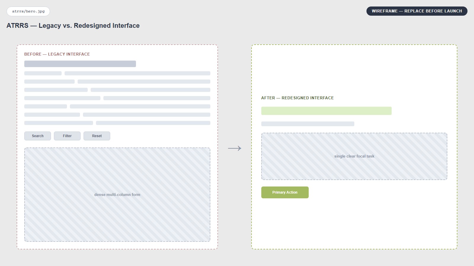
ATRRS is an enterprise system supporting Army training operations and personnel management across multiple roles and access levels. The product had evolved over many years on legacy Visual Basic architecture, and the interface reflected that history: dense workflows, excessive interaction, limited responsiveness, and weak accessibility.
My ownership: modernize the experience and implementation end to end — UX/UI, Figma prototyping, reusable patterns, accessibility, C#/.NET MVC front-end implementation, manual QA, and production deployment.
Working largely as the sole designer, I set the UX and technical direction the rest of the team built to. The design patterns and C#/.NET MVC standards I established were later adopted system-wide across the full ATRRS platform, shaping how subsequent modernization phases were built.
The Challenge
- Long, dense forms with weak visual hierarchy and excessive instructional copy
- Unclear or inconsistent actions, small targets, and limited keyboard support
- Non-responsive layouts that could break at narrow viewports or zoom
- Search and filter workflows that required unnecessary clicks and page changes
- Users deeply accustomed to nearly 20 years of legacy interaction patterns
1. Simplifying Complex Workflows
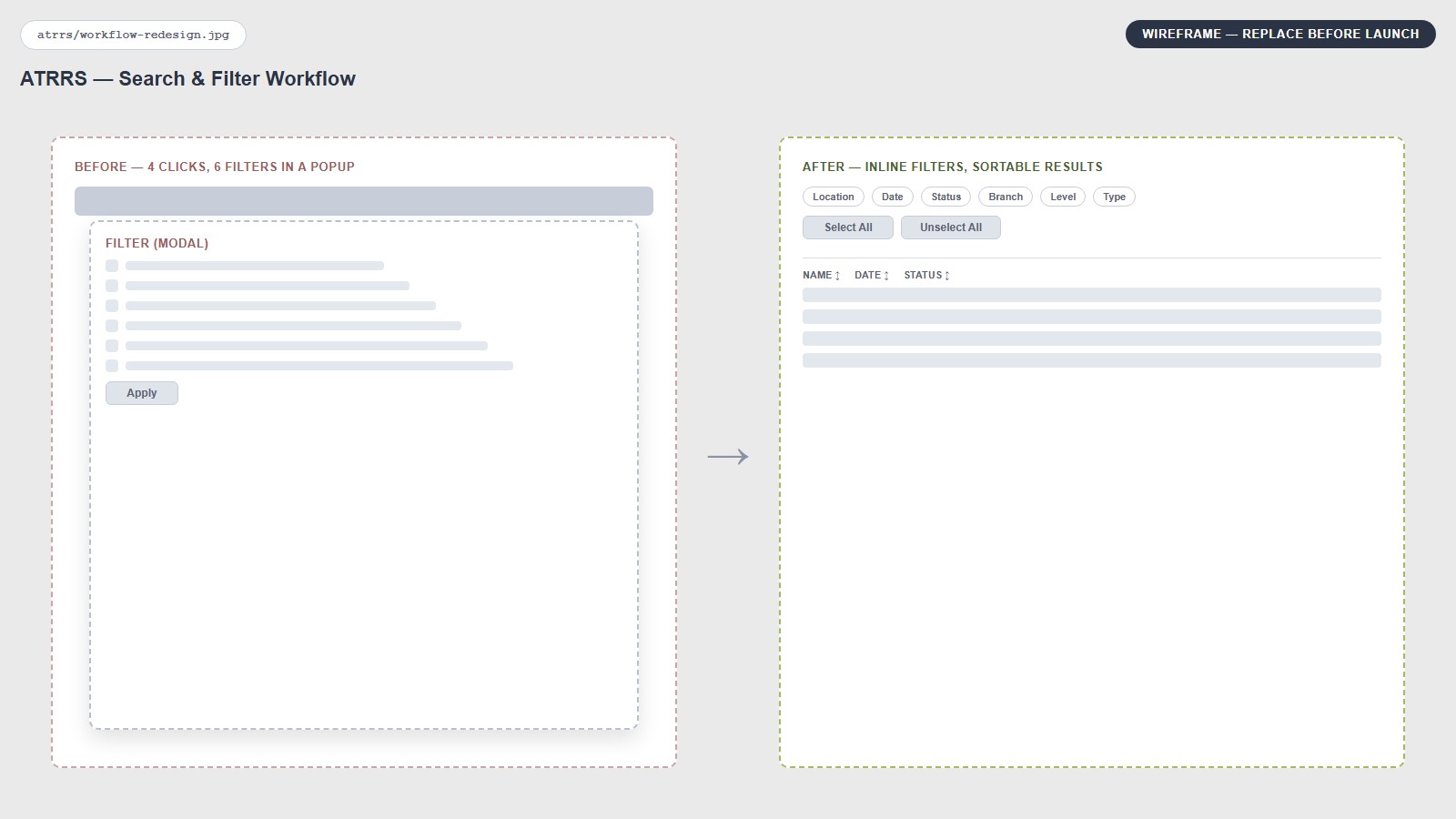
A representative search workflow could require up to four clicks just to initiate a search, plus additional interactions for as many as six filters. Results opened on a separate page, so repeat searches forced users to navigate back and rebuild the flow.
- Reduced the primary search interaction from roughly 4 clicks to 2
- Added Select All / Unselect All controls, eliminating up to 5 individual filter interactions
- Moved sortable results onto the same page so users could refine searches without back-navigation
- Reordered controls around the actual task flow instead of the legacy page structure
2. Accessibility + Form Hierarchy
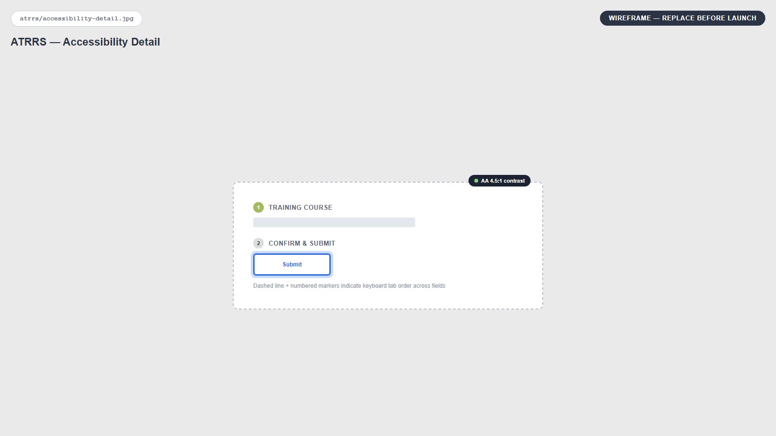
Accessibility was part of the redesign itself, not a final audit step. I manually tested the interface against WCAG 2.1 and Section 508 requirements while also improving visual hierarchy and interaction clarity.
- Keyboard navigation and visible focus states
- Semantic HTML, appropriate ARIA, labels, headings, and accessible table structure
- Larger interaction targets and clearer action states
- Contrast-conscious typography and error/status messaging that did not rely on color alone
- Responsive behavior across desktop, tablet, mobile, and 200% zoom
- Progressive disclosure and tooltips to replace dense instructions and reduce clutter
3. Progressive Disclosure + Clearer Information Architecture
The legacy interface often explained the UI with long blocks of instructions. I simplified wording, improved hierarchy, moved independent actions to more logical positions, and used contextual tooltips only where extra explanation was needed. The goal was to let the interface explain itself through structure, labels, and predictable controls.
Building a Reusable UI System
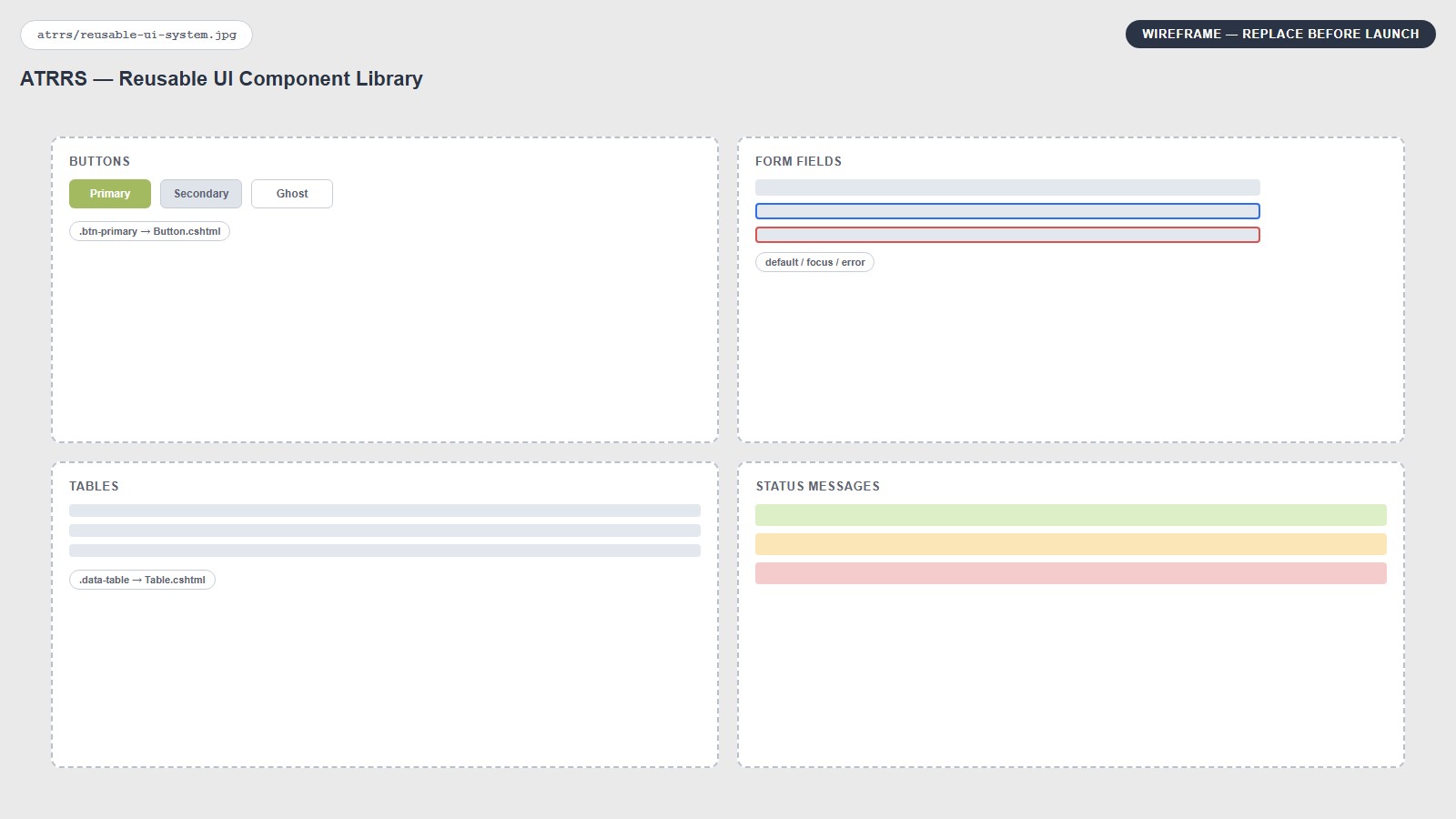
Rather than redesigning isolated screens, I created reusable design modules where each module represented a repeatable function or interaction pattern.
- Consistent buttons, fields, typography, color, and interaction states
- Reusable functional modules for forms, controls, and data presentation
- Shared patterns between the design system and production front-end code
- Responsive behavior built into the system instead of solved page by page
Modernizing the Front End, Under Production Constraints
My role extended beyond Figma handoff. I was responsible for implementing the redesigned interfaces within the application’s C#/.NET MVC architecture using HTML, CSS, JavaScript, and reusable front-end components. I could read the legacy Visual Basic implementation and contributed to the transition toward C#/.NET MVC, with support from the engineering team where needed — that technical depth let me design around real system constraints rather than handing engineering concepts that had to be reinterpreted later. The component structure, accessibility requirements, and MVC conventions I set weren’t just a reference — they were what the engineering team built to, and that consistency carried into later modernization phases beyond my own direct involvement.
I opened the live project through Visual Studio, created local working copies, implemented and tested changes locally, then presented the designs and builds to the team. Leadership shared screenshots with the Army client, returned with feedback, and I revised the design and implementation until the review loop was complete.
Working process: local copy → design + implementation → internal review → Army client feedback through leadership → revision → manual QA/accessibility testing → production source-control commit → production validation.
I effectively owned both design QA and accessibility validation. If a production issue was discovered later, the team could roll back the change.
Change Management: Modernize Without Breaking Familiarity
One of the hardest UX problems was not technical — it was behavioral. Users had spent nearly 20 years accessing certain filters through a separate popup module. Moving everything directly into the form was cleaner, but introducing the full change at once disrupted a deeply familiar workflow.
I treated it as a change-management problem. I preserved some familiar interaction patterns, introduced improvements incrementally, and made targeted compromises where familiarity mattered more than theoretical elegance.
How I Measured Success
Traditional consumer-product metrics were not always available in this environment, so success had to be evaluated through operational and compliance signals instead.
- Fewer clicks and shorter task paths
- Reduced unnecessary page loads and repeat filter setup
- Faster task completion through simpler flows
- Clearer visual hierarchy and lower cognitive load
- Keyboard accessibility and WCAG / Section 508 conformance
- Responsive behavior across viewports and 200% zoom
- User comfort and adoption during gradual modernization
- Successful production deployment and acceptance of the redesigned workflows
Impact
- Deployed redesigned workflows into the live production system
- Reduced representative search workflows from roughly 4 primary interactions to 2
- Eliminated up to 5 additional filter interactions through bulk-selection controls
- Removed unnecessary back-navigation and repeat filter setup
- Delivered fluid, responsive layouts across desktop, tablet, mobile, and accessibility zoom
- Established reusable design and front-end components later adopted system-wide across the full ATRRS platform
- Modernized legacy VB-era interfaces within a C#/.NET MVC architecture
- Balanced major usability improvements with the needs of users accustomed to nearly two decades of legacy behavior
Successful enterprise modernization is not about replacing every legacy pattern at once. It is about improving efficiency, accessibility, consistency, and maintainability while understanding which familiar behaviors users still depend on.